Bulk RNA-seq (8): Differential Analysis and Volcano Plotting with DESeq2
Note
Here, we demonstrate how to sift through the complex data to identify genes of interest and showcase their expression patterns through an elegant volcano plot. We’ll also link back to our previous blog where we prepared the ids for gene annotation, tying our narrative together in a symphony of scientific discovery.
Differential Expression Analysis with DESeq2:
# Starting DESeq2 analysis to find differentially expressed genes (DEGs)
dds2 <- DESeq(dds)

# Extracting and examining the DEGs
resultsNames(dds2)
res <- results(dds2)
head(res)
class(res)
summary(res)

# The results are stored in a dataframe for easier data manipulation
res1 <- data.frame(res)
Explanation: This section of the code initiates the differential expression analysis using the DESeq2 package and then extracts the results. These results are then converted into a dataframe for easier handling in subsequent steps.
Filtering and Annotating DEGs:
# Filtering for significant DEGs
res_deseq2 <- as.data.frame(res) %>%
  arrange(padj) %>%
  dplyr::filter(abs(log2FoldChange) > 1, padj < 0.05)

# Annotating DEGs based on their expression changes
res1 %>%
  mutate(group = case_when(
    log2FoldChange >= 1 & padj <= 0.05 ~ "Up-regulated",
    log2FoldChange <= -1 & padj <= 0.05 ~ "Down-regulated",
    TRUE ~ "Not-significant"
  )) -> res2

# Summarizing the count of DEGs in each category
table(res2$group)

# Exporting the annotated DEGs to a CSV file
write.csv(res_deseq2, file = "diff_expr_results.csv", quote = FALSE)
Explanation: Here, the code filters the results to focus on genes with significant expression changes. The genes are then categorized as up-regulated, down-regulated, or not significant based on their log2 fold changes and adjusted p-values. A summary table is created to count the number of genes in each category, and the annotated data is saved as a CSV file.
Preparing Data for Volcano Plotting:
# Preparing the data for visualization
deg.data <- read.csv("res2.csv")
deg.data$logp <- -log10(deg.data$padj)

# Merging gene data with annotations from the previous blog post
gene_data <- merge(deg.data, ids, by = "ensembl_gene_id")

# Adding labels for significant genes in the volcano plot
gene_data$label <- ""
gene_data <- gene_data[order(gene_data$log2FoldChange),]
up.genes <- tail(gene_data$mgi_symbol[which(gene_data$group == "Up-regulated")], 5)
down.genes <- head(gene_data$mgi_symbol[which(gene_data$group == "Down-regulated")], 5)
gene_data$label[match(c(up.genes, down.genes), gene_data$mgi_symbol)] <- c(up.genes, down.genes)

# Removing any rows with missing data
gene_data <- na.omit(gene_data)
Explanation: The code snippet prepares the dataset for creating a volcano plot, a type of scatter plot that shows statistical significance (p-value) versus magnitude of change (fold change). The ids variable, which contains gene annotations from the previous blog post, is merged with the DEGs to annotate them properly. Significant genes (top5 & down5) are labeled for better visibility in the plot.
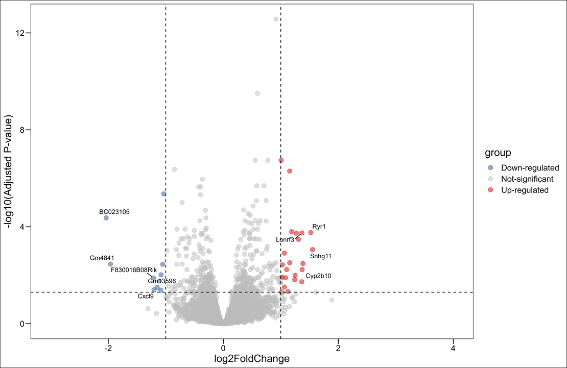
Creating and Saving the Volcano Plot:
# Creating the volcano plot using ggplot2
pi<- ggscatter(gene_data, x="log2FoldChange",y="logp",
               color="group",
               palette = c("#2F5688","#BBBBBB","#CC0000"),
               size=3,
               alpha=0.5,
               repel=T,
               xlim=c(-3,4),
               xlab = "log2FoldChange",
               ylab ="-log10(Adjusted P-value)" ) +
  theme_base() +
  geom_hline(yintercept=1.30,linetype="dashed")+
  geom_vline(xintercept= c(-1,1),linetype="dashed") +
  geom_text_repel(data=subset(gene_data, !is.na(label)),
                  aes(label=label),
                  size=3.5,
                  box.padding = unit(0.35, "lines"),
                  point.padding = unit(0.3, "lines"),
                  max.overlaps = 100)
pi


ggsave("volcano.png",units="cm",dpi=1200)
ggscatteris used to create a basic scatter plot withlog2FoldChangeon the x-axis and-log10(Adjusted P-value)on the y-axis.- The
colorargument, along withpalette, is used to color-code points by their group, which represents whether they are upregulated, downregulated, or not significant. geom_hlineandgeom_vlineadd dashed lines to the plot, which help to visually identify the cutoffs for significance and fold change.geom_text_repelfrom theggrepelpackage is used to add labels to significant genes, preventing them from overlapping and making them easier to read.
Finally, we save the plot as a high-resolution PNG image:

Next, we saved all the genes with significant expression in an excel file. This section of code is used to identify and save all the genes with significant expression changes based on the predetermined thresholds for p-value (adjusted) and log2 fold change. The tibble, tidyr, dplyr, and ggplot2 packages are used for data manipulation and plotting throughout various analyses, ensuring the flexibility to shape and visualize data as required. The final significant results are saved to a CSV file called sig_res.csv.
# Set a significance cutoff for adjusted p-values
padj_cutoff <- 0.05

# Filter the results to include only significant gene changes
# Here we're interested in genes with an adjusted p-value less than the cutoff
# and an absolute log2 fold change greater than 1
sig_res <- dplyr::filter(res1, padj < padj_cutoff & abs(log2FoldChange) > 1) %>%
  dplyr::arrange(padj)  # Arrange the results by p-value

# Display the significant results
sig_res

# Load necessary packages for data manipulation and plotting
# If not already installed, uncomment the install.packages("tibble") line
#install.packages("tibble")
library(tibble)
library(tidyr)
library(dplyr)
library(ggplot2)

# Write the significant results to a CSV file for sharing or further analysis
write.csv(sig_res, file = "sig_res.csv", quote = FALSE)